Color Palette Generator
Palette Color Variations
|
! This online Color Palette Generator tool works well on larger displays like desktop/laptop screens or switch to desktop mode in the mobile browser. |
|
~ Color Name is not the exact match. It is the nearest matching name to the Hex Code. |
| - Indicates no matching color name found. |
Color wheel - Color scheme palette generator and editor
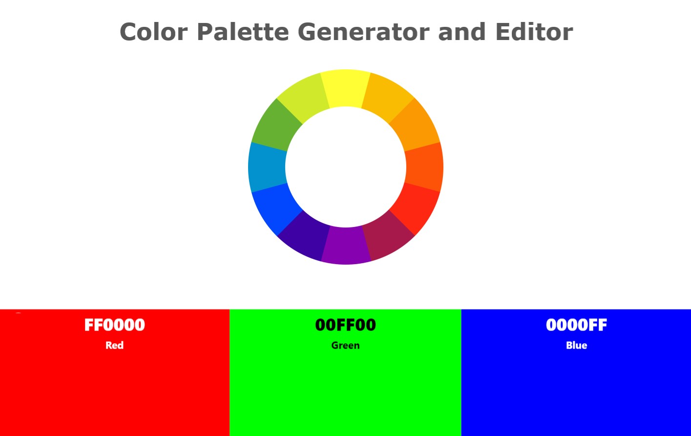
Create and edit the color palette using the color scheme and palette generator. A color wheel generator. Apply the color palette to design mockups.

Generate a random color palette by selecting the color scheme. The palette generator also comes with the palette visualization for website mockup, mobile app mockup, geometric pattern, T-Shirt designs, and graphs. Check how the palette looks by applying the color palette to the different mockups and designs provided by the editor.
- Random 3 Color Palette Generator for 60-30-10 rule
- Random 4 color palette generator
- Random 6 color palette generator
- Monochromatic generator
- Analogous generator
- Complementary generator
- Split Complementary generator
- Triadic generator
- Tetradic generator
- Hexadic generator
- Pastel color palette generator
- Dark color palette generator
3 Color Palette Generator for 60-30-10 rule
Generate three color palette that work well together and can be used as the primary, secondary, and accent colors in your design. By using just three colors, you can create a sense of balance and simplicity, while still allowing for plenty of creativity. The 60-30-10 rule is a popular guideline for using three-color palettes in design. According to this rule, 60% of your design should be made up of the dominant color, 30% should be the secondary color, and 10% should be the accent color.
4 Color Palette Generator
Four color palettes offer more flexibility and complexity in design than three-color palettes. With four colors, you can create a wider range of moods and styles, while still maintaining balance and harmony. One common way to use a four-color palette is to choose a dominant color, two supporting colors, and an accent color. The dominant color should be the main color in your design, while the supporting colors should complement it. The accent color can be used to add a pop of color and draw attention to certain elements, just as in a three-color palette.
6 Color Palette Generator
If you're looking to add a touch of vibrancy to your design or require more variety in terms of color options,
six color palettes can be an good option. These palettes offer a diverse range of colors, providing you with the flexibility you need to create a visually striking and eye-catching design.
Six-color palettes provide even more flexibility and complexity in design than four-color palettes. With six colors, you can create a wide range of moods and styles, while still maintaining balance and harmony.
One way to use a six-color palette is to choose a dominant color, two supporting colors, and three accent colors.
Another way to use a six-color palette is to choose three sets of complementary colors. For example, you might choose blue and orange as one set, green and purple as another set, and yellow and red as a third set. When used together, these colors can create a sense of vibrancy and energy, while still maintaining balance.
Pastel Color Palette Generator: A Soft Touch for Design
Pastel color palettes are known for their soft, muted tones that evoke calmness.
Colorxs pastel color palette generator is a fantastic tool for designers and creatives like you to incorporate these delicate shades into the project.
Generate endless pastel combinations that perfectly balance soft hues.
Find Matching Color Names for Your Palette
After you create your color palette with our Color Palette Generator, you can instantly discover the matching color names from popular color systems and paint brands. This makes it super easy to find real-world color matches for your designs, artwork, home projects, or branding ideas.
Our tool automatically shows you color names from multiple categories, including Named Colors, Paint Colors (All Brands), Sherwin-Williams, and Benjamin Moore. You can also view matches in professional color systems like Pantone PMS, Pantone TCX, RAL Classic, and RAL Design. Whether you’re designing a logo, planning a room makeover, or creating digital art, you’ll always know the closest paint or Pantone shade for your favorite colors.
This feature helps you bridge the gap between digital and physical color choices — perfect for designers, DIY decorators, and anyone who loves exploring color combinations. Try generating your own palette and see how each color connects to real-world paint and Pantone names!


