
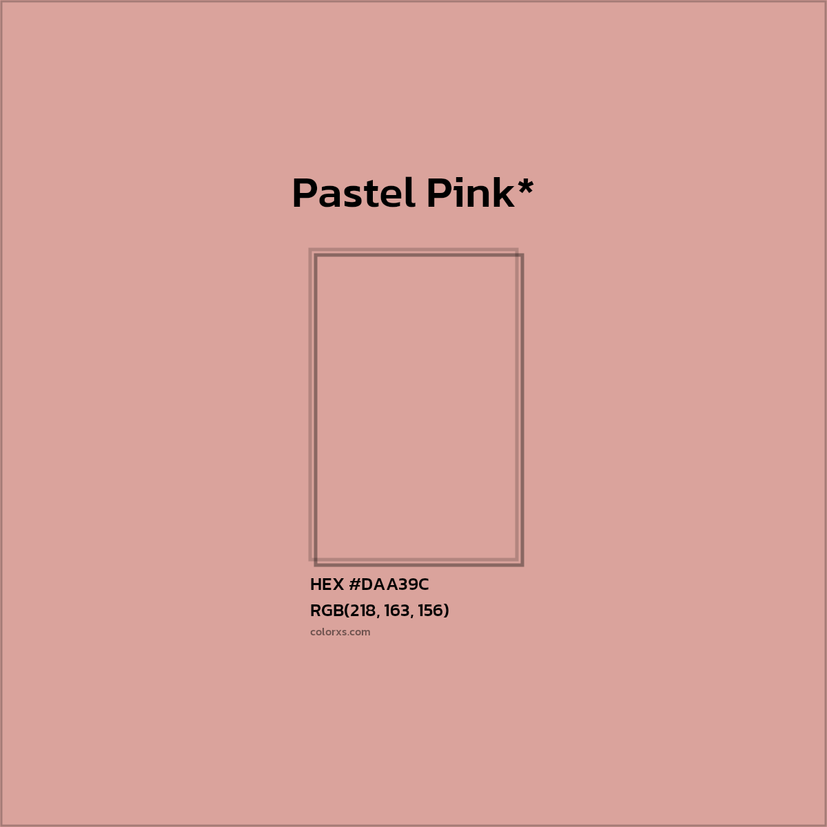
What color is DAA39C?
The RGB color code for color number #DAA39C is RGB(218, 163, 156). In the RGB color model, #DAA39C has a red value of 218, a green value of 163, and a blue value of 156. The CMYK color model (also known as process color, used in color printing) comprises 0.0% cyan, 25.2% magenta, 28.4% yellow, and 14.5% key (black). The HSL color scale has a hue of 6.8° (degrees), 45.6 % saturation, and 73.3 % lightness. In the HSB/HSV color space, #DAA39C has a hue of 6.8° (degrees), 28.4 % saturation and 85.5 % brightness/value.
Color DAA39C is cool or warm?
Color DAA39C is a warm color.
What is the LRV of #DAA39C? (For interior and product design)
DAA39C has an LRV of nearly 44. By LRV value, it is a medium light color.
Light Reflectance Value (LRV) is a measure of how much visible light is reflected off a surface. It is a number on a scale of 0 to 100, with 0 being pure black and 100 being pure white. The higher the LRV, the more light the color reflects and the lighter it will appear.
Compare LRV 44 of #DAA39C with dark and light color
Is #DAA39C Readable? WCAG Contrast Checker (For digital design)
Check if the color DAA39C meets Web Content Accessibility Guidelines (WCAG) standards, minimum contrast ratio standards between text and background colors. The WCAG (Web Content Accessibility Guidelines) provides global standards for readable web content.
WCAG Recommendations - Large Text: above 18pt or 14pt bold. Normal Text: below 18pt or 14pt bold.
- Minimum contrast ratio (AA): 4.5 for normal text and 3 for large text.
- Enhanced contrast ratio (AAA): 7 for normal text and 4.5 for large text.
Normal text - 14pt
Normal Bold text - 12pt
Large text - 18pt
Large Bold text - 14pt
Color Codes - Color Space Conversions
HEX #DAA39C color codes / color number / color space conversions - RGBA, HSL, HSV/HSB, HYZ, CMY, HWB, RYB
- Hex triplet
- #DAA39C
- Red
- DA
- Green
- A3
- Blue
- 9C
- Red
- 218 (85.5%)
- Green
- 163 (63.9%)
- Blue
- 156 (61.2%)
- Alpha
- 1 (100.0%)
- Cyan
- 0.00%
- Magenta
- 25.23%
- Yellow
- 28.44%
- Key
- 14.51%
- Hue
- 6.77°
- Saturation
- 45.59 %
- Lightness
- 73.33 %
- Hue
- 6.77°
- Saturation
- 28.44 %
- Brightness / Value
- 85.49 %
- Red
- 51 (19.8%)
- Yellow
- 69 (27.1%)
- Blue
- 43 (17.0%)
- Hue
- 6.77°
- Whiteness
- 61.18 %
- Blackness
- 14.51 %
- Cyan
- 14.51%
- Magenta
- 36.08%
- Yellow
- 38.82%
- X
- 48.01
- Y
- 43.5
- Z
- 37.32
- Y1
- 43.5
- X
- 0.37
- Y2
- 0.34
- L
- 71.89
- A
- 19.35
- B
- 11.58
- L
- 71.89
- C
- 22.55
- H
- 30.88
- L
- 71.89
- U
- 36.01
- V
- 12.65
- L
- 65.95
- A
- 14.52
- B
- 12.62
- LRV
- ~ 43.5 %
- Munsell Color System
- 0.4YR 7.0/4.4
Color Names, Similar Colors and Paint
What is Delta E (ΔE)?
Delta E is the standard measure of how different two colors look to the human eye, rather than how far apart their hex codes happen to be. It runs from 0, an exact match, to 100, the largest possible difference — so the lower the Delta E, the closer the match. The match percentage shown on each color below is simply 100% minus its ΔE.
Color Name of HEX #DAA39C
These are the named colors closest to hex DAA39C, closest match first. Each card shows how much of the color the human eye sees as the same, measured as Delta E (ΔE).
Similar colors from Pantone, RAL and other color matching system
Pantone PMS
Pantone PMS color similar/equivalent to DAA39C.
Pantone TCX
Pantone TCX color similar/equivalent to DAA39C.
RAL Design
RAL Design color similar/equivalent to DAA39C.
RAL Classic
RAL Classic color similar/equivalent to DAA39C.
British Standard 4800
British Standard 4800 color similar/equivalent to DAA39C.
Paint color for Hex #DAA39C
These are the real paint colors closest to hex DAA39C from major brands, ranked by Delta E (ΔE) match. A paint above 98% will be hard to tell apart from DAA39C once it is on a wall.
PPG Paints
Hex color DAA39C similar/equivalent paint from PPG Paints. Conversion of hex #DAA39C to PPG Paints
Behr
Hex color DAA39C similar/equivalent paint from Behr. Conversion of hex #DAA39C to Behr
Benjamin Moore
Hex color DAA39C similar/equivalent paint from Benjamin Moore. Conversion of hex #DAA39C to Benjamin Moore
Farrow & Ball
Hex color DAA39C similar/equivalent paint from Farrow & Ball. Conversion of hex #DAA39C to Farrow & Ball
Dunn-Edwards
Hex color DAA39C similar/equivalent paint from Dunn-Edwards. Conversion of hex #DAA39C to Dunn-Edwards
Valspar
Hex color DAA39C similar/equivalent paint from Valspar. Conversion of hex #DAA39C to Valspar
Sherwin Williams
Hex color DAA39C similar/equivalent paint from Sherwin Williams. Conversion of hex #DAA39C to Sherwin Williams
Color Combinations and Matching Colors
#DAA39C color palettes and scheme combination
Monochromatic colors belong to the same hue angle but different tints and shades. Monochromatic color palette can be generated by keeping the exact hue of the base color and then changing the saturation and lightness.
Analogous colors are a group of colors adjacent to each other on a color wheel. Group of these adjacent colors forms Analogous color scheme Palette. Analogous Palette can be generated by increasing or decreasing the hue value by 30 points.
The triadic color palette has three colors separated by 120° in the RGB color wheel
The tetradic colour scheme composed of two sets of complementary colors in a rectangular shape on the color wheel.
Complementary / Opposite Color
Complementary / Opposite Color
Complementary colors are pairs of colors which, when combined or mixed, cancel each other out (lose hue) by producing a grayscale color like white or black. When placed next to each other, they create the strongest contrast for those two colors. Complementary colors also called opposite colors. Complementary color schemes are created using two opposite colors on the color wheel. The examples are red–cyan, green–magenta, and blue–yellow.
What is the contrasting color of #DAA39C?
Color that best contrast with #DAA39C is #9CD3DA, color name is Powder Blue*. Contrast indicates a strong difference in color. Contrasting color can be found several ways, Complimentary contrast is one of them. Complementary contrast colors are opposite each other on the color wheel.
What color compliments #DAA39C?
Complementary or Opposite color for #DAA39C is #9CD3DA, color name is Powder Blue*.